You are not logged in. Please register or login.
- Topics: Active | Unanswered
Re: Trying something new (updated)
Will wrote:Cheers for the feedback guys.
We've removed all background images on mobiles just to make use of all space. Not sure whats causing the flickering on the viewtopic page but will try to replicate.
Also check out the latest smiley from Russ!
buzzsaw asked for a "thinner '92 axl" so this is what I came up with:
darker, longer hair, blue bandana and beard.
LOVE it. and very useful... check my post in the Kimmel thread. 
Re: Trying something new (updated)
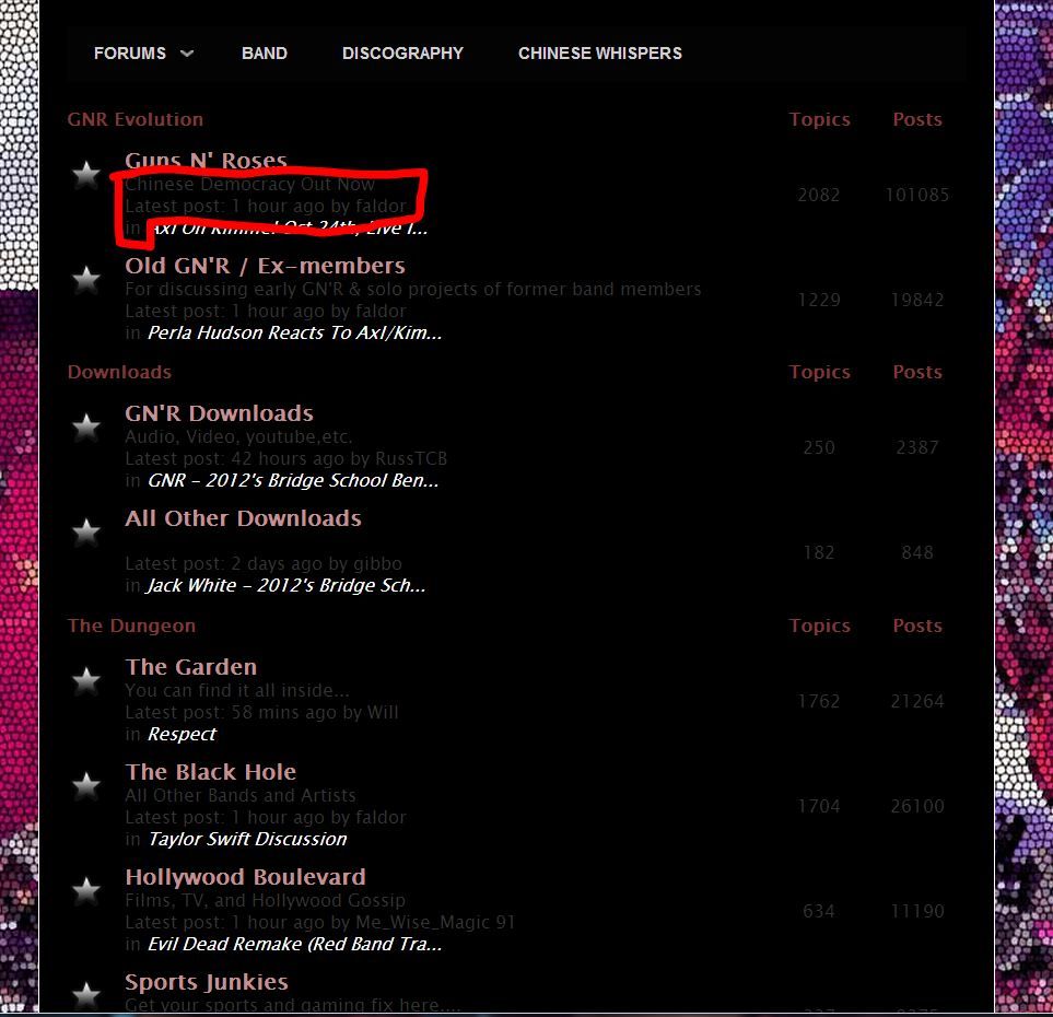
Not a big fan of it, I do like the font and the text colours, its just the images down either side of the screen seem massive and detract from reading the page, hurts my eyes to be honest. Mabye I'm just used to GNREvo being mostly black. I'm vewing on a laptop.
I liked the old chinese whispers layout much better as well, such a body of work is deserving of more than just a mere header at the top of the page, its famous across the GNR forums and should have a showpiece intro.
It probably just takes a bit of getting used to, I got a new tv the other week and hated it, now after living with it for a while I'm very happy with it.
One thing I noticed, I changed my avatar and had to try a few times cause the picture was too big and denied, on the old site i could choose any picture on my pc and it would scale down automatically. (I think!)
Re: Trying something new (updated)
Obviously we can't please everyone but we're listening to you all and tweaking the forum daily to try and find the right balance 
I liked the old chinese whispers layout much better as well, such a body of work is deserving of more than just a mere header at the top of the page, its famous across the GNR forums and should have a showpiece intro.
I was actually intending to give Chinese Whispers more credit than I felt it was getting. Funny how different people perceive things 
Instead of it being on a stale sidebar it was promoted to being on the main menu to try and show it off more. I also added code specifically for Whispers so that the years/links now run along the top of each section, making it easier to continue reading the story. Previously after reading a year you would have to return to the introduction thread to find the next link.
That section could be given a custom background or header image but that would be up to sic to decide if he wants it editing 
Any chance of changing the dark grey font i can hardly read it 22 That colour up the top would be alright lighter grey
Done 
The hidden text isnt working
On my to-do list still.
Cheers again everyone for all the testing and feedback. You're not a bad bunch 

 That colour up the top would be alright lighter grey
